 Ozmium Docs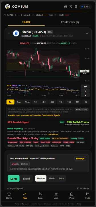
Charts
How to read the Ozmium chart on the Risk screen - candles, timeframes, indicator chips, candlestick patterns, and what a LONG or SHORT marker actually means.
The chart on the Risk screen is the same one that sizes a position, so what it shows and what the ticket does are never two different opinions. This page explains how to read it.
Picking a Market
The market picker opens a searchable list of every tradeable pair. Tabs narrow it by class - crypto, forex, metals, energy, indices, equities - and the star tab is your favorites.
Tapping the star on any row favorites that market. The star swallows the tap so it never opens the market by accident, and favorites are stored per device rather than against your wallet, so nothing about your list touches the chain or leaves the browser.
Candles and Timeframes
Two controls change what you see, and they are independent of each other.
| Control | What It Sets |
|---|---|
| Candle Size | How much time one bar covers: 1m, 5m, 15m, 1H, 4H, 6H, 1D, 1W, 1M, 1Y. |
| Range | How much total time is on screen, from three minutes out to the market's entire life. |
Because they are separate, one-minute candles across a full day and daily candles across a year are both valid views. Your choice is remembered per market, so returning to a pair reopens it the way you left it.
A candle size is offered only when the market has actually existed long enough to draw one. A pair a few months old will not offer yearly bars, because three bars is the minimum that can be read as a chart at all.
Zoom far enough out and the chart switches from candles to a line. Past roughly four hundred visible bars the candles overlap into noise, so the line is the honest rendering.
Switching timeframe keeps the old bars on screen while the new ones load. You never get a blank chart, and the previous view stays readable until the replacement is ready.
Reading a Candle
Each candle covers one interval and reports four numbers: where the interval opened, where it closed, and the highest and lowest it traded. The body spans open to close, green when the close was higher and red when it was lower. The thin wicks above and below reach to the high and the low.
A long body means one side controlled the whole interval. A small body with long wicks means price went somewhere and came back, which is a different market than the one that simply went up.
The Reference Lines
A chart can carry more than one price. Each line is labeled at the right edge, and appears only when the prices differ enough to matter.
| Line | What It Is |
|---|---|
| The mark | The price you would actually fill at on the venue. Once the market shuts it holds the last real close rather than drifting on an off-hours quote. |
| CB | A Coinbase reference for the same asset, drawn when it has parted from the venue mark by more than 0.03 percent. Gold references PAXG, which is spot metal rather than a contract. |
| IDX | The venue's own index - the oracle its liquidations read - drawn when the mark has come off its own index. That gap is the venue's internal skew, and it is worth seeing before you size a position. |
| SPOT | The venue's spot price, on a chart whose history is a futures contract. |
| FUT | The futures price, on a chart where the venue's own tape is being drawn instead. |
The last two need explaining. A commodity has no futures tape of its own on this venue, so its history comes from the front-month contract - CL=F for crude, GC=F for gold - while the venue marks and liquidates against a spot oracle. The two prices differ. Measured on one afternoon: crude 0.86 percent, gold 1.32 percent, Brent 2.42 percent. The line appears once the gap clears 0.2 percent, and is suppressed when another line already sits on that price.
Candlestick Patterns
Specific shapes and sequences have names, and the chart marks them when they appear. Tapping any marked formation opens its clinical definition alongside a citation, so you can read the textbook source rather than take the app's word for it.
| Pattern | What It Describes |
|---|---|
| Bullish Engulfing | A small red candle fully engulfed by the next, larger green one. Buyers overwhelm the prior session after a decline. |
| Bearish Engulfing | A small green candle fully engulfed by the next, larger red one. Sellers overwhelm the prior session after an advance. |
| Hammer | A small body at the top with a long lower shadow after a downtrend. Sellers pushed price down and buyers reclaimed it. |
| Hanging Man | The same shape after an uptrend, where the long lower shadow instead warns that selling is appearing. |
| Shooting Star | A small body at the bottom with a long upper shadow after a rally. Buyers drove price up and were rejected. |
| Doji | Open and close virtually equal, forming a cross. Neither side won the session. |
| Morning Star | A three-bar bottoming reversal: large red, a small-bodied pause, then a large green closing back into the first. |
| Evening Star | The topping equivalent: large green, a pause, then a large red closing back into the first. |
| Three White Soldiers | Three consecutive long green candles, each closing higher. Sustained buying. |
| Three Black Crows | Three consecutive long red candles, each closing lower. Sustained selling. |
| Piercing Pattern | A red candle, then a green one opening below the low and closing above the red body's midpoint. |
| Dark Cloud Cover | A green candle, then a red one opening above the high and closing below the green body's midpoint. |
| Marubozu | A long body with no meaningful shadows. One side controlled the entire session, open to close. |
The Indicator Chips
Underneath the price, the indicator pane draws several measurements on a shared scale, and each one appears as a tappable chip. Tapping a chip opens its definition and citation, the same way a pattern does.
| Chip | What It Measures |
|---|---|
| Trend | Direction and persistence of the move. |
| RSI | Momentum on a 0 to 100 scale. Conventionally, above 70 reads as overbought and below 30 as oversold. |
| MACD | The relationship between two moving averages, used to spot momentum shifts. |
| Stochastic Oscillator | Where the close sits within its recent high-low range. |
| Williams %R | A related momentum reading on an inverted scale. |
| Moving Average | The average close over a window, here twenty bars. |
| Bollinger Bands | Bands set a number of standard deviations from that average, so width is volatility. |
| Rate Of Change | How fast price has moved over a window, regardless of direction. |
| ADX | How strong a trend is, without saying which way it points. |
| OBV | Running volume weighted by whether each bar closed up or down. |
| CVD | Cumulative volume delta, the running difference between buying and selling pressure. |
| Open Interest | How much leveraged position is currently open in this market. |
A divergence is when price and an indicator disagree - price making a new high while momentum does not, for instance - and both the pane and the markers treat that as meaningful.
What LONG and SHORT Mean
A marker on a bar is a directional read, drawn as a small colored tab with one word across it in white capitals. Green tabs read LONG, red tabs read SHORT, and the two words map directly onto the two things you can do with a perpetual:
| Marker | Color | The Position It Suggests |
|---|---|---|
| LONG | Green | You profit if price rises, and are liquidated if it falls far enough. |
| SHORT | Red | You profit if price falls, and are liquidated if it rises far enough. |
SHORT does not mean sell what you own. On the Risk screen it means open a short, which is a new position rather than an exit. Closing an existing position is a separate action.
The scoreboard row beneath the chart, and a few of the screenshots on this page, still say BUY and SELL. They describe the same two directions.
Each marker carries a conviction value rather than being a yes or no. That number comes from combining every indicator above into one weighted read, where each input leans bullish or bearish and carries its own weight. Agreement across many inputs produces high conviction; a single indicator firing alone produces low conviction, and the marker is drawn faintly to say so.
Several conditions deliberately suppress a marker or force it to neutral:
- Regime gating. A long signal in a market whose broader trend is down is downgraded rather than shown, because the setup and the environment contradict each other.
- Macro blackout. Around scheduled high-impact events, directional reads are withheld.
- Thin books. Crowd positioning is only read as a signal when there is enough open interest to mean anything, and never gets to outvote the measured indicators.
The last constraint is worth stating plainly: crowd positioning is capped at half the influence of the measured signal, because it is the one input that cannot be backtested. Gains publishes no positioning history, so a live book read against an old bar would be an anachronism.
What They Look Like in Practice
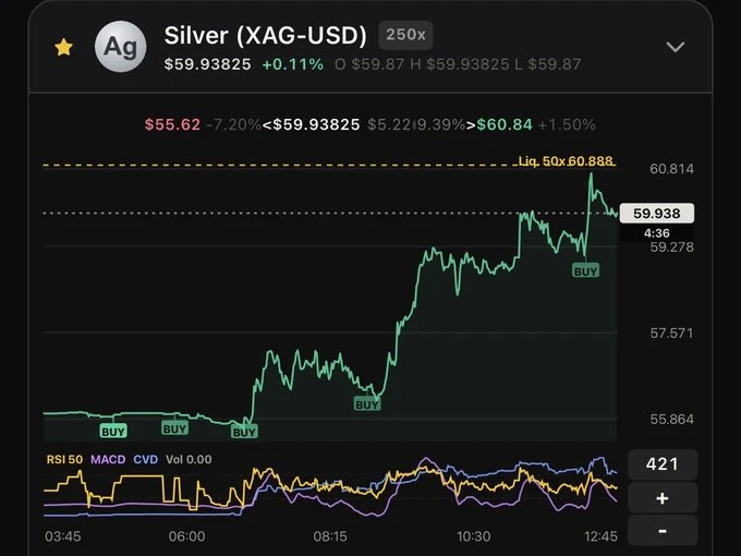
Four consecutive BUY markers on silver, each landing at a local low before the move. The liquidation line for the open position is drawn above the price, and the indicator pane carries RSI, MACD, and CVD across the same window.
One chart is not evidence of an edge, and this page has already said the markers are unproven. It is shown because it is what a working signal looks like when it works, and because reading the markers against the pane beneath them is the skill this page is trying to teach.
Experimental Signals
The markers are switched off until you ask for them. Experimental Signals is a toggle on the signal panel, off by default, and it needs a connected wallet to turn on. Nothing on the chart changes until it is on.
What appears when it is are Ozwald's own signposts: trades the agent considered, some of which it went on to place as a paper trade or a live one. They are a record of what the desk was looking at, not a recommendation and not a call for you to follow.
What the Transparency Means
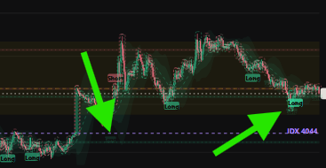
How solid a marker looks is the conviction behind it. For markers belonging to the timeframe you are viewing, that comes from the strength of the rules that fired, blended with live agreement from the Gains order book: how the crowd is actually positioned in that market right now. A book leaning the same way draws the marker bolder. A book leaning hard against it fades the marker toward a whisper, but never erases it. A signal the rules measured still shows, because the book is the one input that cannot be tested against history and so never gets the final word.
Markers From Other Timeframes
Some faint markers are not low conviction at all. They belong to a different candle size.
A ghost overlay draws the signals from every other timeframe onto the chart you are looking at, placed by the time they happened. That is what lets a one-minute signal and a five-minute signal sit in the same view without switching charts, so agreement across candle sizes is something you can see in one glance instead of reconstructing from memory.
The rule for telling them apart is simple. The solid markers belong to the timeframe you are on. The ghosts sit underneath them, thinned out so several timeframes never carpet the chart.
When Markers Cluster
Cluster is the word to watch. The more tightly these appear together, on one timeframe or across several, the more pressure Ozwald is under to take a live trade rather than settle for a paper one. A lone marker in an empty stretch of chart is the agent noting something. A knot of them is the agent running out of reasons to sit still.
Where the Explanation Stops
That is the honest end of what is published. Beyond it, the weighting is Ozwald's own strategy for Ozmium's holdings, and it stays proprietary.
That boundary costs you nothing. It does not affect, gate, or degrade anything about your use of the products or the data you receive. The markers are shown because watching a working desk think is more useful than a number with no history behind it, and none of it is financial advice. Trading with leverage carries risk of total loss.
Where the Data Comes From
None of this is invented, and none of it is a single feed taken on faith.
| Layer | Source |
|---|---|
| Onchain State | Base mainnet, read directly over JSON-RPC. Balances, positions, pool state, and pending orders come from the contracts themselves rather than from an intermediary. |
| Perpetual Markets | Gains Network gTrade, for pair parameters, open interest, and the live book. |
| Lending Markets | Morpho and Aave, for vault and market state. |
| Spot Prices and Routes | Coinbase Developer Platform, alongside Coinbase Advanced Trade market data. |
| Equities, Indices, Forex, and Commodities | Public market data feeds covering the non-crypto classes gTrade lists. |
| Reference and Corroboration | Public aggregators, used to cross-check rather than as a primary. |
Two rules govern how those are combined. A figure is never reported more confidently than its source supports, so a failed read holds its last known-good value and marks it stale instead of printing a zero. And no single feed is trusted alone where a second one exists to check it, which is why a price that two sources disagree about is treated as uncertain rather than averaged into false precision.
A third rule covers what is refused. Feeds return bars that no market printed, and these are dropped before the chart is drawn.
| Refused | Why |
|---|---|
| A closed market's final quote | Exchanges settle before their tape stops. Crude settles at 14:30 New York and trades until 17:00, and the feed writes that settlement onto the last bar as though it were a trade. On a shut market that bar is dropped, so the chart ends on the last traded price. |
| Bars for hours a venue was shut | Weekends and overnight halts are removed rather than drawn as a flat shelf. |
| A tape with no highs or lows | Some feeds sample a quote and label it a one-minute bar, so every candle is a doji with no inside. The chart steps up to a size the tape supports, or uses the venue's own tape. |
The window's high and low always describe the bars on screen, not the wider window fetched behind them to make the session clip work.
The specific weighting, cross-checking, and signal construction are not published.
The Backtest Panel
The signal panel can replay the strategy over the loaded window, recomputing the verdict at each bar from only the information available at that bar and checking how often the direction matched the next candle. That produces a win rate over the tested window.
Treat it as a description of that window and nothing more. It is not a forecast, the sample is small, and a strategy that fit one window is not thereby correct about the next.